[Exclusive] Key to design is inclusivity and exploration: WhatsApp's...
There can be two sides to this coin — immense stress or a sense of responsibility. For more than two billion people, it means that you need to be very intentional about any change that you are introducing, says Idit Yaniv, who is head of WhatsApp Design at Meta. Yaniv is a firm believer in taking that responsibility very seriously because it isn’t easy to deliver an app that simply works for WhatsApp’s active user base, last counted at 2 billion (and increasing). That makes Meta’s WhatsApp by far the biggest instant messaging app worldwide. Numbers at the close of April by research firm Statista peg WeChat as its closest competitor, a distant second with 1.3 billion active users. Meta’s Messenger app (you may recall this as Facebook Messenger, from earlier) clocks 1.01 billion, while Telegram clocks in with 900 million and Snapchat has 800 million logged in.

The Latest Design Tweaks in WhatsApp
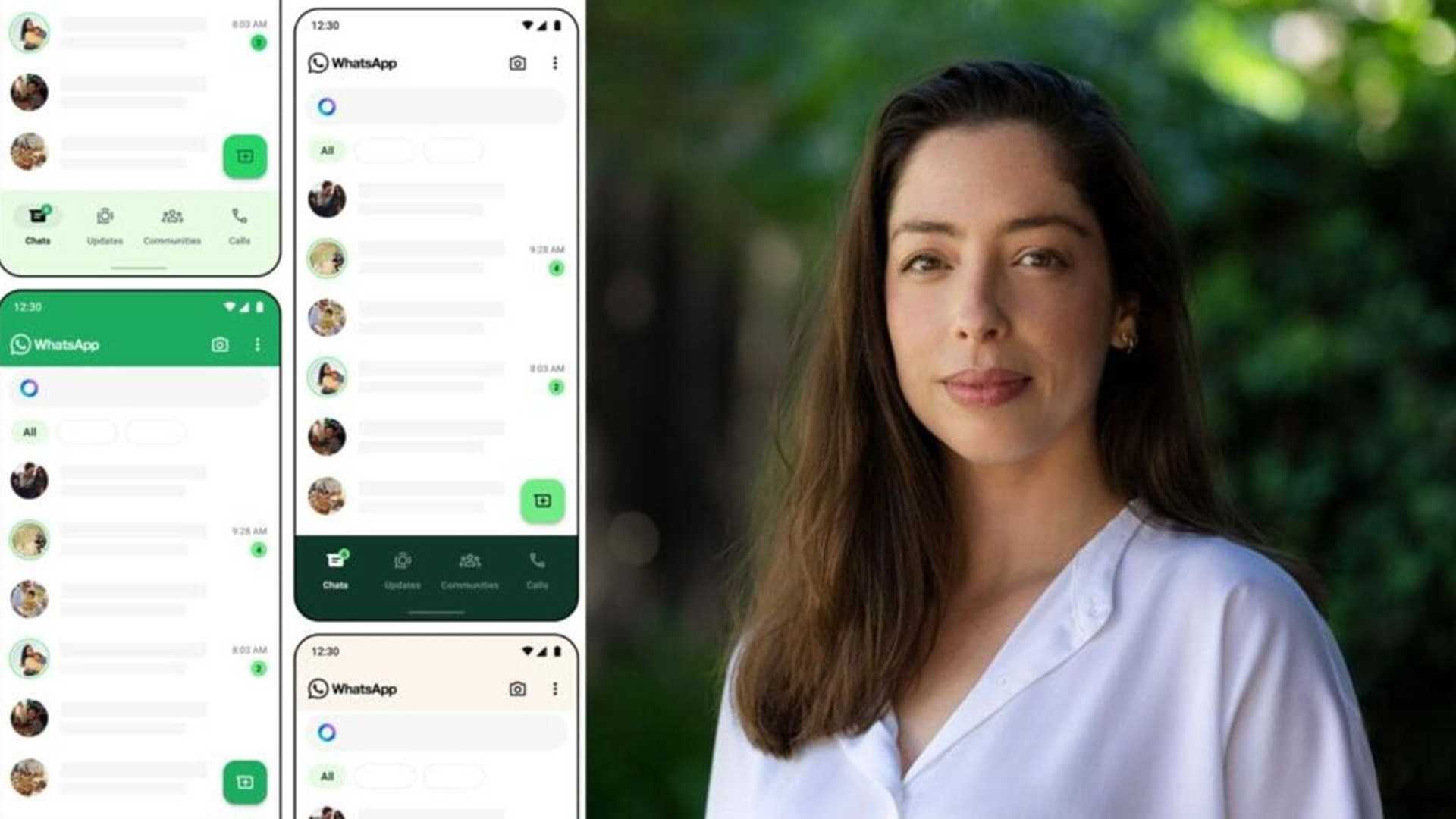
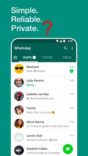
The latest pursuits of Yaniv’s team at Meta must now be visible in WhatsApp on your phone, with significant tweaks to the user interface. Depending on whether you’re using WhatsApp on Android or iOS, or even on macOS or Windows, there are changes that become immediately visible. Such as the green colour palette, which replaces blue, and its increased visibility aspect has become clearer as days have passed. There are new icons, a redesigned attachment tray, the redesigned Android Bottom Bar and the iOS Top Bar along with Chat Filters that give users a better grip on the chat status – unread chats, groups, and so on.
Designing for Two Billion Users
In a conversation, Yaniv talks about the intricacies of designing an app that should work for the 2 billion users, aligning Meta’s vision for WhatsApp with what users are demanding and how they’re preparing for the arrival of Meta AI for more users in the coming months. She also gives us a confirmation that WhatsApp is indeed working on something referred to as ‘themes for chats’, which we may see at some stage later in the year. It’s still very early work.
User Inputs and Design Changes
Yaniv mentions that they work closely with people’s feedback, do a lot of user research, and look at what people tell them across different channels of communication. They want to make sure that they’re as connected as possible to what people want. One significant change is the shift from the familiar blue color to the iconic WhatsApp green, after exploring more than 35 different color variations. The focus is on accessibility, making the app easier to use, and enhancing the overall user experience.
Future of WhatsApp Design
Yaniv expresses excitement about the future of WhatsApp’s design, particularly with the integration of Meta AI. The goal is to enhance how users communicate and empower them to communicate in new ways. The team remains principled about designing for everyone and focusing on inclusivity in communication.