How to Connect Scatter Points in Google Sheets using ChatGPT
Have you ever found yourself struggling with scatter plots in Google Sheets, wishing there was an easy way to connect those dots for better clarity? Scatter plots are fantastic for illustrating relationships between data points, but sometimes, connecting the points can make the visualization even more powerful. Fortunately, with the assistance of AI like ChatGPT, you can achieve this seamlessly. In this guide, we'll walk you through the process of connecting scatter points in Google Sheets using ChatGPT, enhancing your data visualization skills.
Setting Up Your Data
Before delving into how ChatGPT can aid you, let's start from the beginning. To create a scatter plot in Google Sheets, you need to have your data ready and organized correctly. Typically, you'll have two columns representing the X-axis and Y-axis values respectively.
Once your data is prepared, you can proceed to create your scatter plot by selecting the data, navigating to the "Insert" menu, and selecting "Chart." While Google Sheets automatically generates a chart, you may need to adjust some settings to convert it into a scatter plot. Access the Chart Editor, choose "Scatter chart" under the "Chart type" section, and customize it to suit your requirements.
Utilizing ChatGPT for Connected Scatter Points
Google Sheets does not inherently connect scatter plot points, but with the help of ChatGPT, you can achieve this desired effect. ChatGPT acts as a knowledgeable companion, offering guidance on unfamiliar formulas and functions, and suggesting ways to enhance your scatter plot visualization.
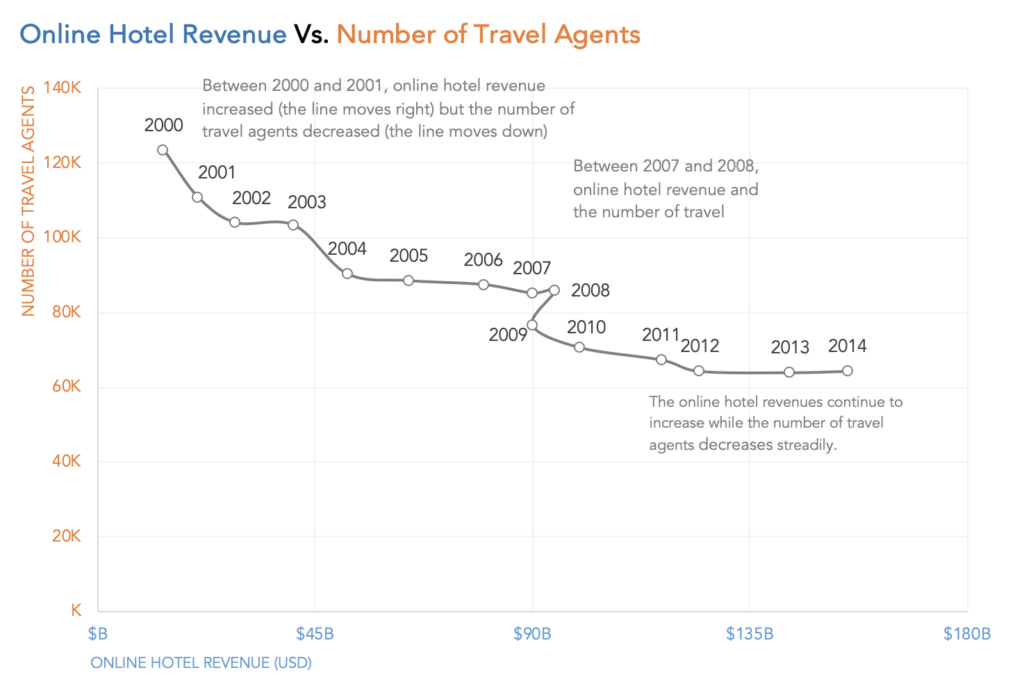
To connect the scatter plot dots, you can overlay a line graph on the chart, visually connecting the points. Ensuring consistent data formatting is crucial to align the scatter plot and line series accurately.
ChatGPT can assist in manipulating data to improve the coherence of your scatter plot. By leveraging ChatGPT's insights, you can refine your scatter plot's trend lines and enhance its interpretability.
Advanced Techniques and Troubleshooting
While basic connectivity is essential, the integration of advanced techniques can further elevate your data visualization. ChatGPT can aid in predictive modeling, enabling you to forecast future trends based on your scatter plot data.

Enhancing the visual appeal of your scatter plot can significantly improve its effectiveness in conveying information. By incorporating appealing visuals, you can make your scatter plot not only informative but also engaging.
Collaboration between AI tools like ChatGPT and human expertise is key to achieving optimal results. While ChatGPT offers valuable suggestions, your understanding of the data context is indispensable in decision-making.
Connecting scatter points in Google Sheets has never been easier with the assistance of AI technologies like ChatGPT. From the initial setup of your Google Sheet to troubleshooting issues and enhancing visual appeal, you now have a comprehensive toolkit at your disposal.