Google Revamps Its Iconic 'G' Logo for the First Time in 10 Years
Google has officially refreshed its iconic ‘G’ logo, marking the first major visual change in nearly a decade. The company has replaced its traditional solid-color design with a fluid gradient that subtly blends red, yellow, green, and blue hues. This modernization aligns with Google’s broader push toward artificial intelligence integration.

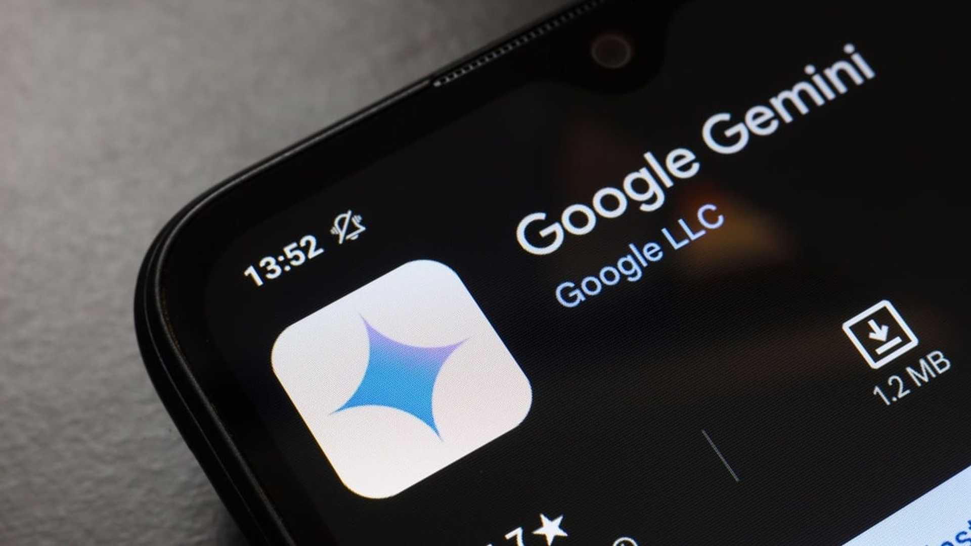
The updated logo not only modernizes Google’s branding but also reinforces its commitment to AI-powered advancements. The shift mirrors Google’s AI assistant Gemini, which also features gradient branding, suggesting a unified visual identity for Google’s AI-driven future.
According to reports, the redesigned logo enhances visibility across diverse screen technologies, making it more adaptable for smartphones, desktops, and other digital platforms. Currently, the new ‘G’ logo is visible to iOS users via the Google Search app, as well as some Android devices via the Google app beta version (16.18). Pixel phones are among the first to showcase the change. However, Google’s traditional logo remains unchanged across most web-based platforms, with an anticipated wider rollout in the coming weeks.
Odia short story collection 'Unmilana'
Odia short story collection ‘Unmilana’, co-authored by Prasanta Mishra (Pundarika) and Kumar Aurojyoti (Ambarisa), was recently published...

Pragativadi News Coverage
News, as it should be covered, has been the forte of Pragativadi over the years. And this has ensured a classy readership encompassing the who’s who of the state. The people who matter in Odisha depend on Pragativadi. For opinion leaders, decision-makers, and people with surplus disposable income, Pragativadi is a must.


